
Website Rewrite & Redesign
Website Rewrite &
Redesign
Niche: Elite Private Security
Brief From The Client:
“Our position in the market has shifted to more high-end clients and contracts, and we need our website to reflect that, both in our branding and overall style and how it delivers information about our services…
We also want help to restructure how we present Blayde and its different divisions.”
Initial Evaluation Of The Old Site:

Everything from the copy style to the logos and the overall design and structure of the website was outdated and off-brand.
The layout was fragmented and inaccessible for users to navigate successfully and find the required information.
It had inconsistent copy and design (typos, broken links, repeated copy sections, and images).
Nothing about the messaging or the aesthetic distinguished the brand from its competitors.
There was no clear pathway or call to action to encourage the customer to take action throughout the website.
Our Approach
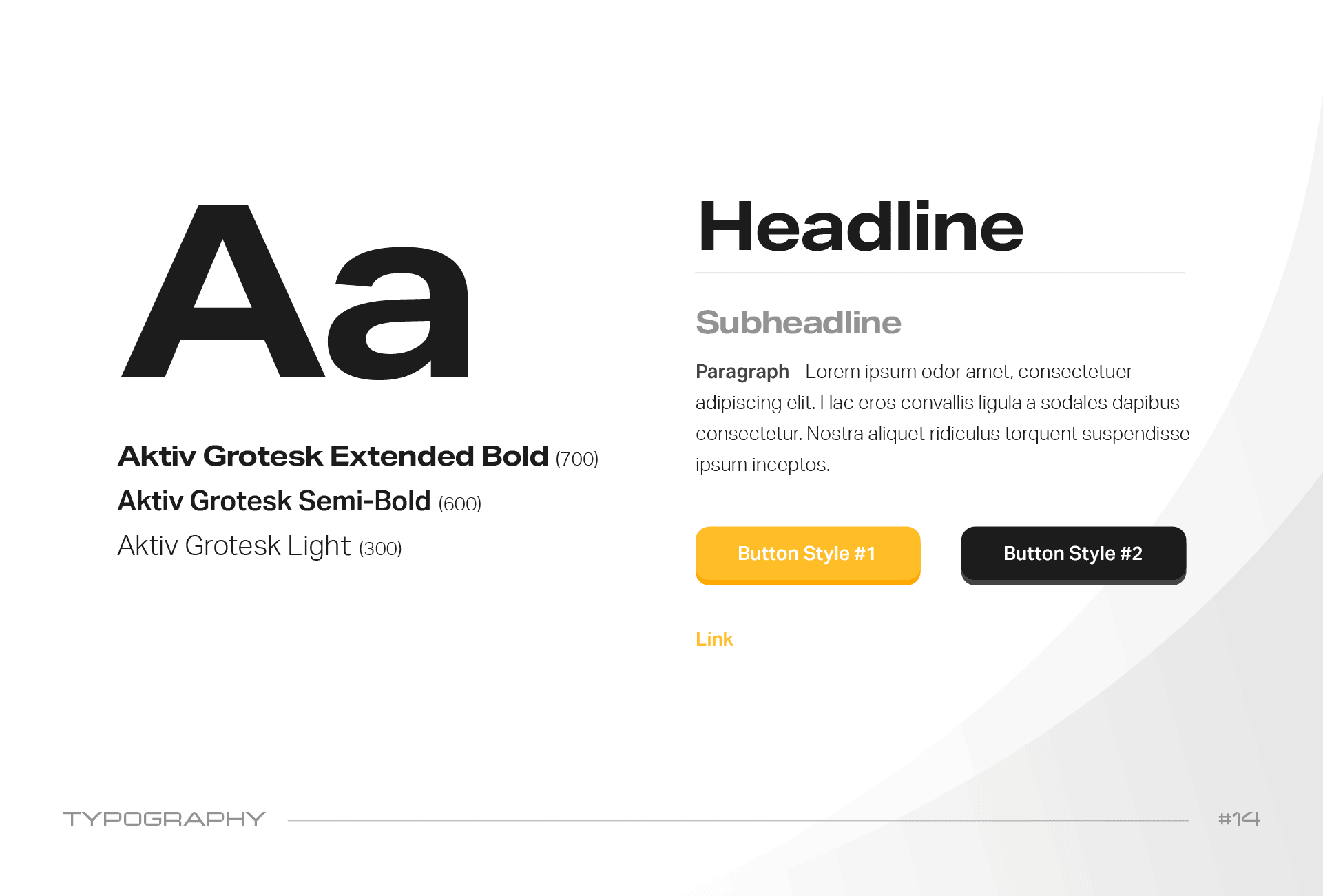
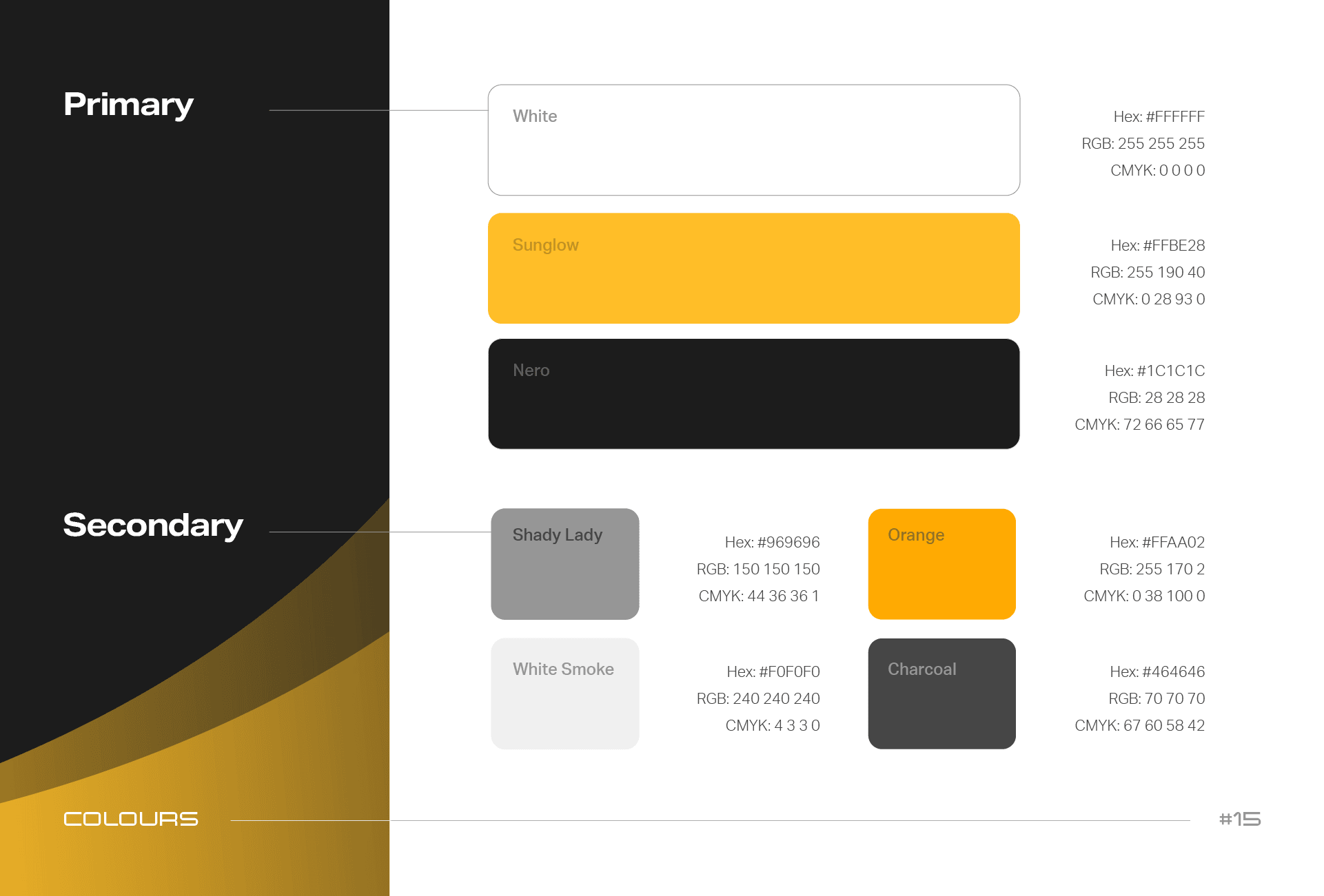
Step #1: Logos & Branding
Refresh Document
Phase #1:
logos & Branding Refresh Document
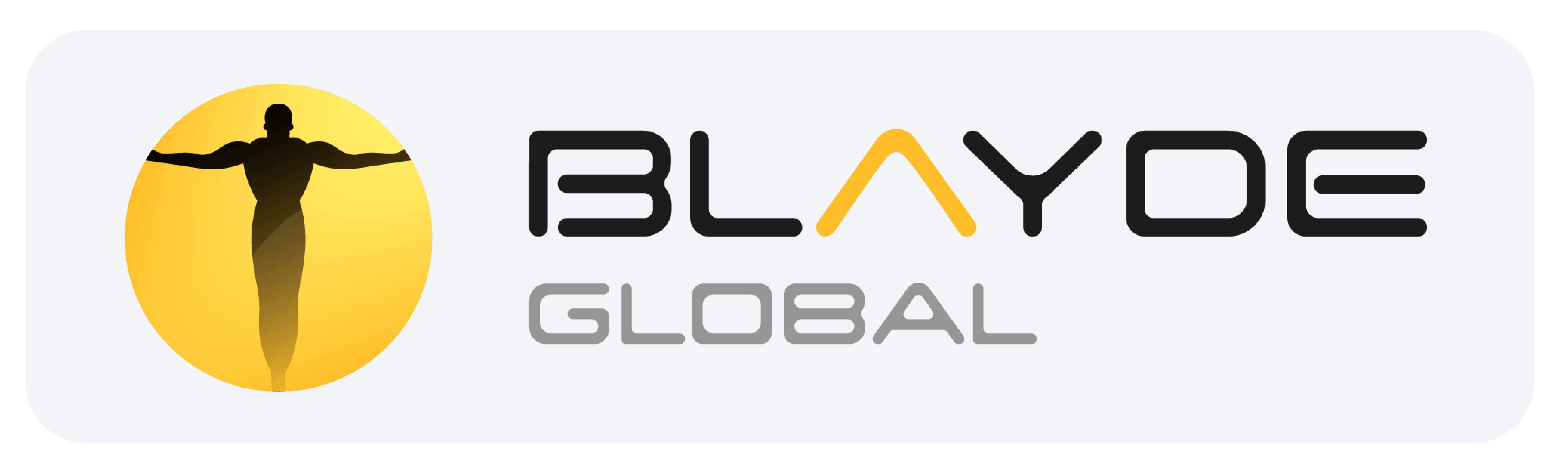
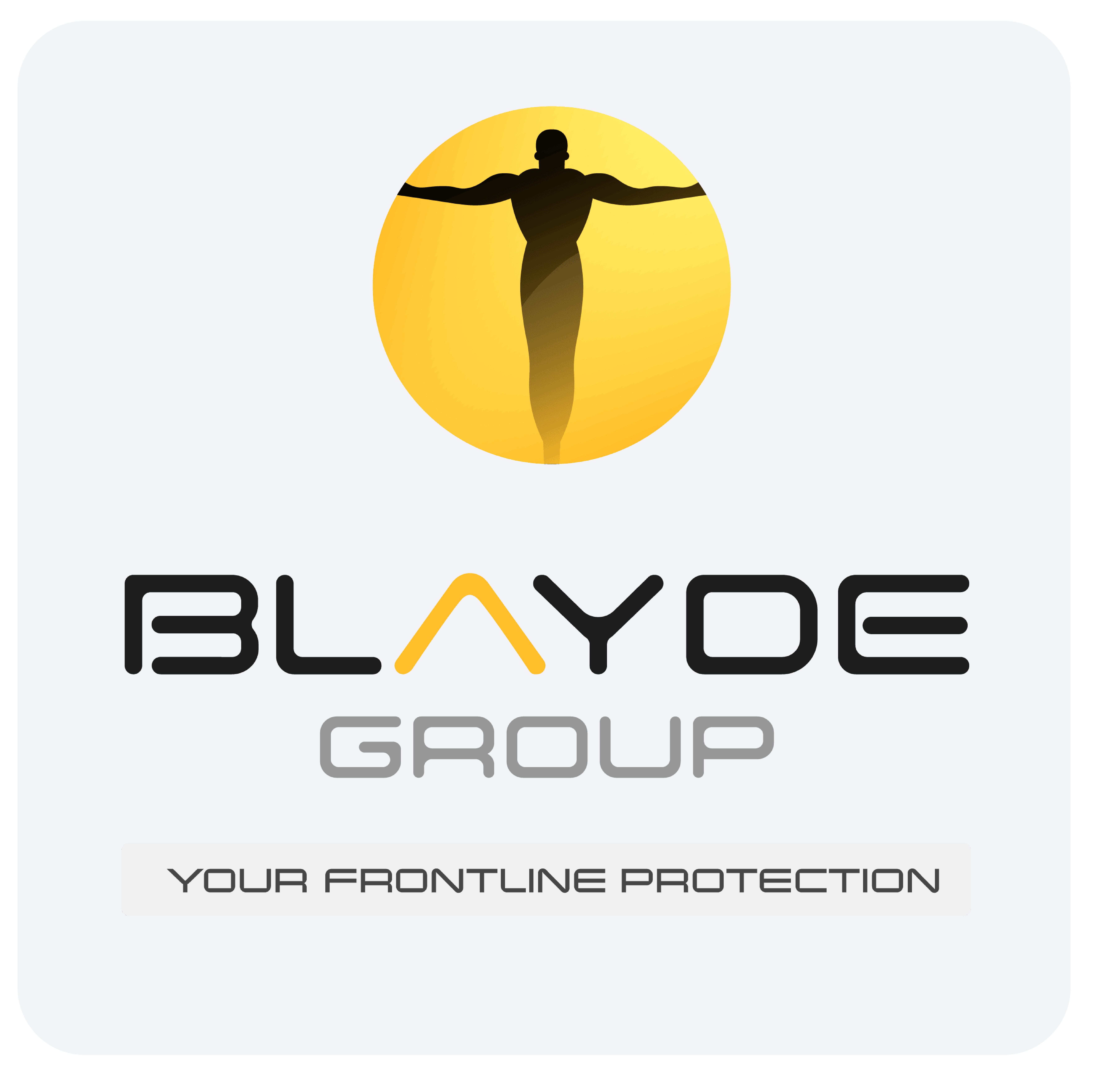
Old Logo
Old Logo
New Logo
New Logo

The client wanted a refresh rather than a full redesign so that their brand would remain recognisable but present as more high-end.
We suggested introducing versatility and structure to the brand by making the logo more streamlined throughout all of Blayde’s different divisions:
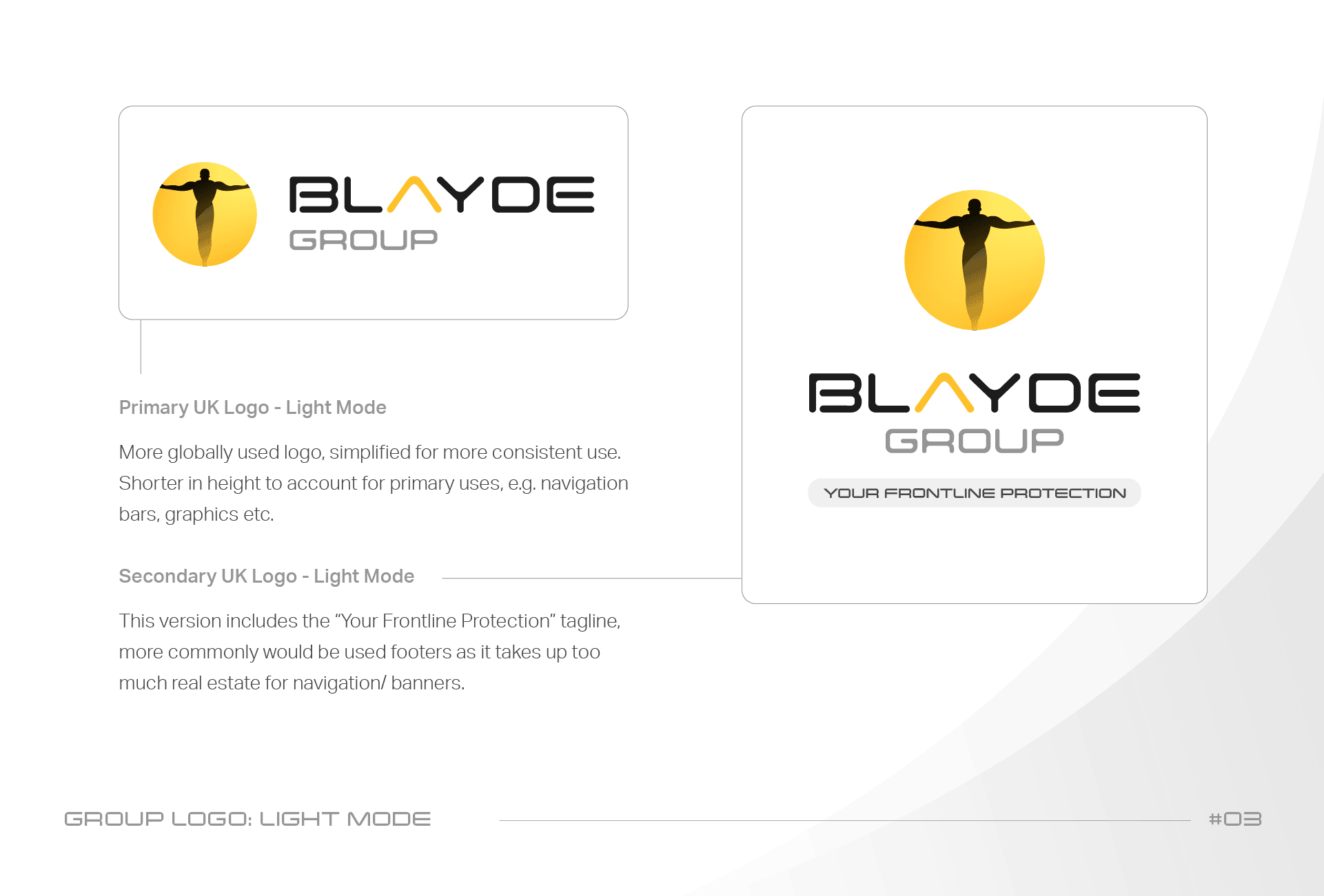
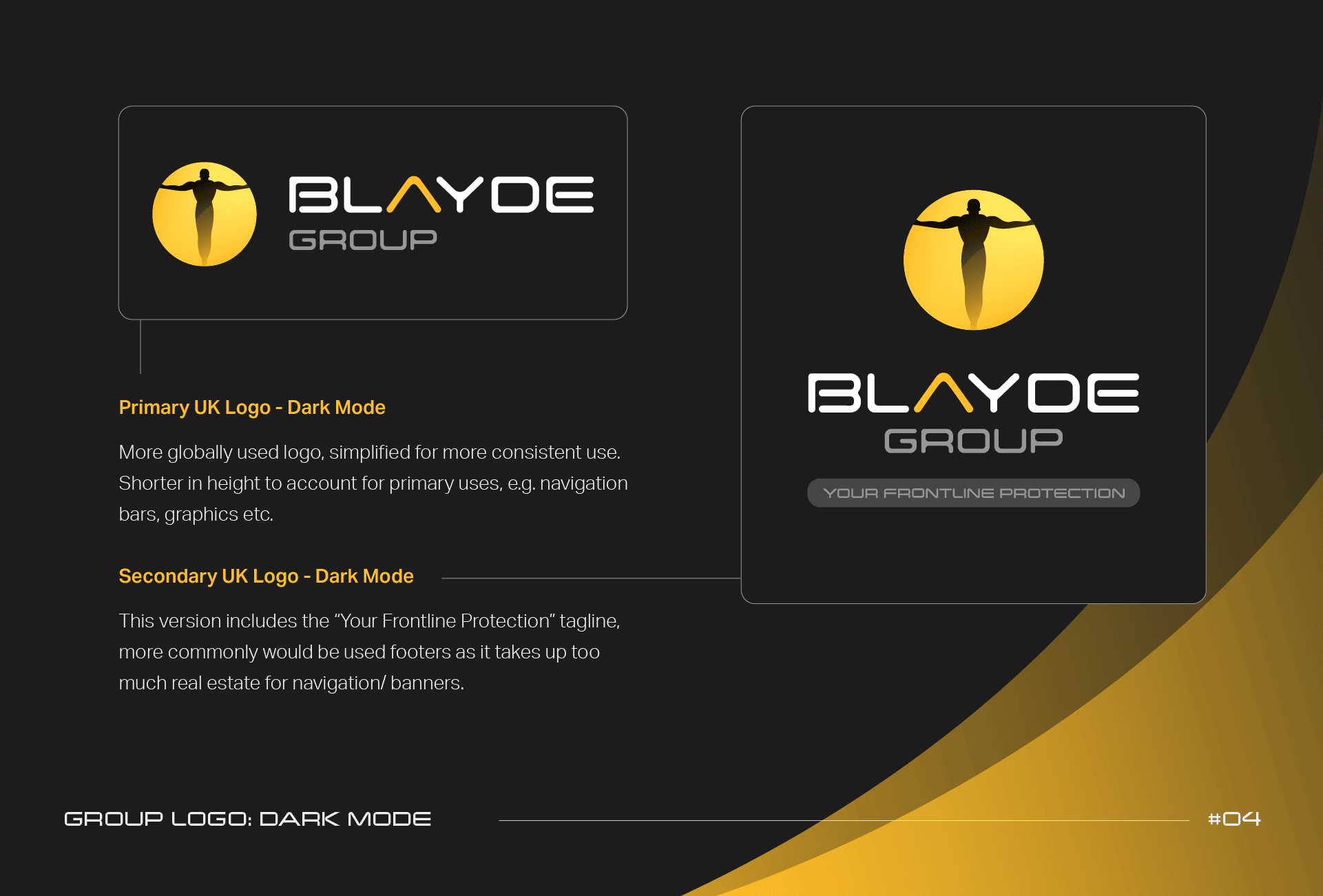
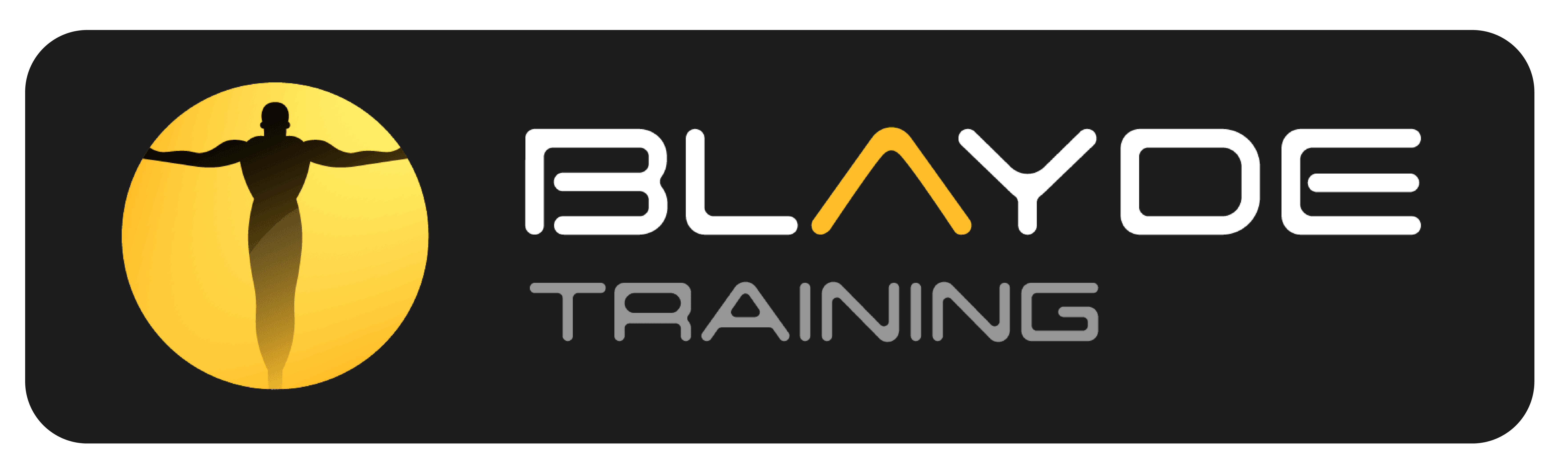
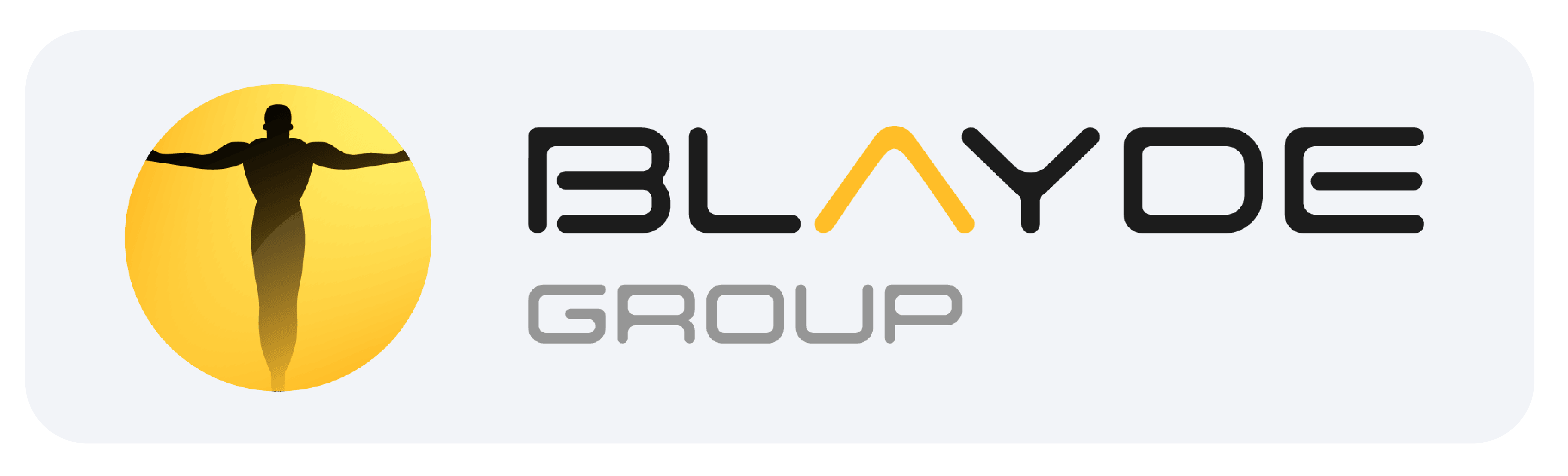
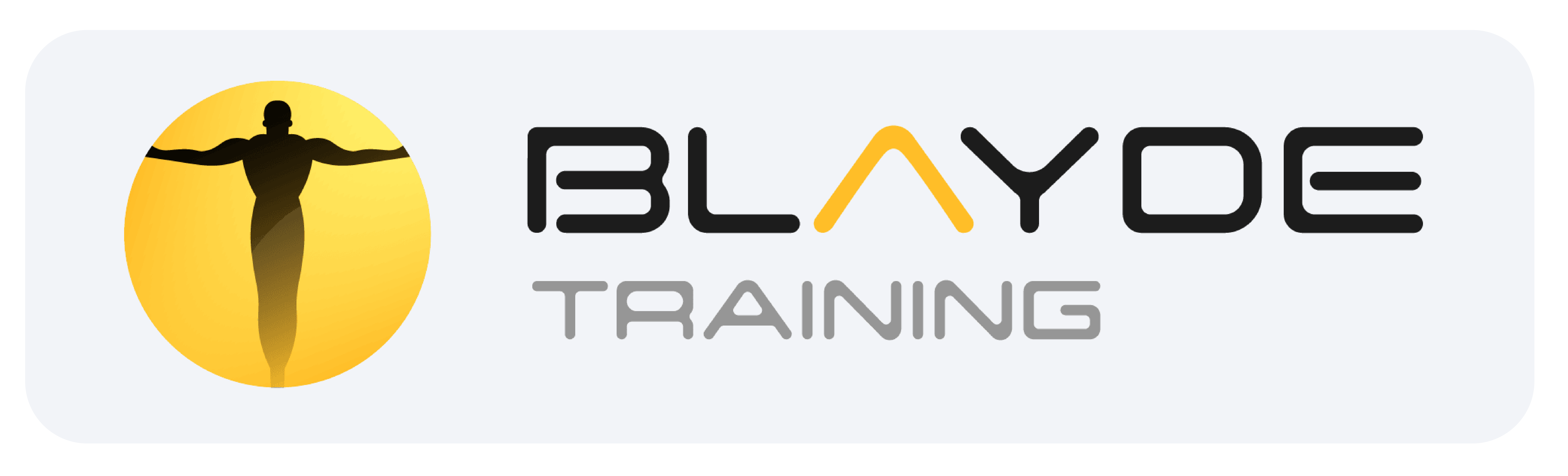
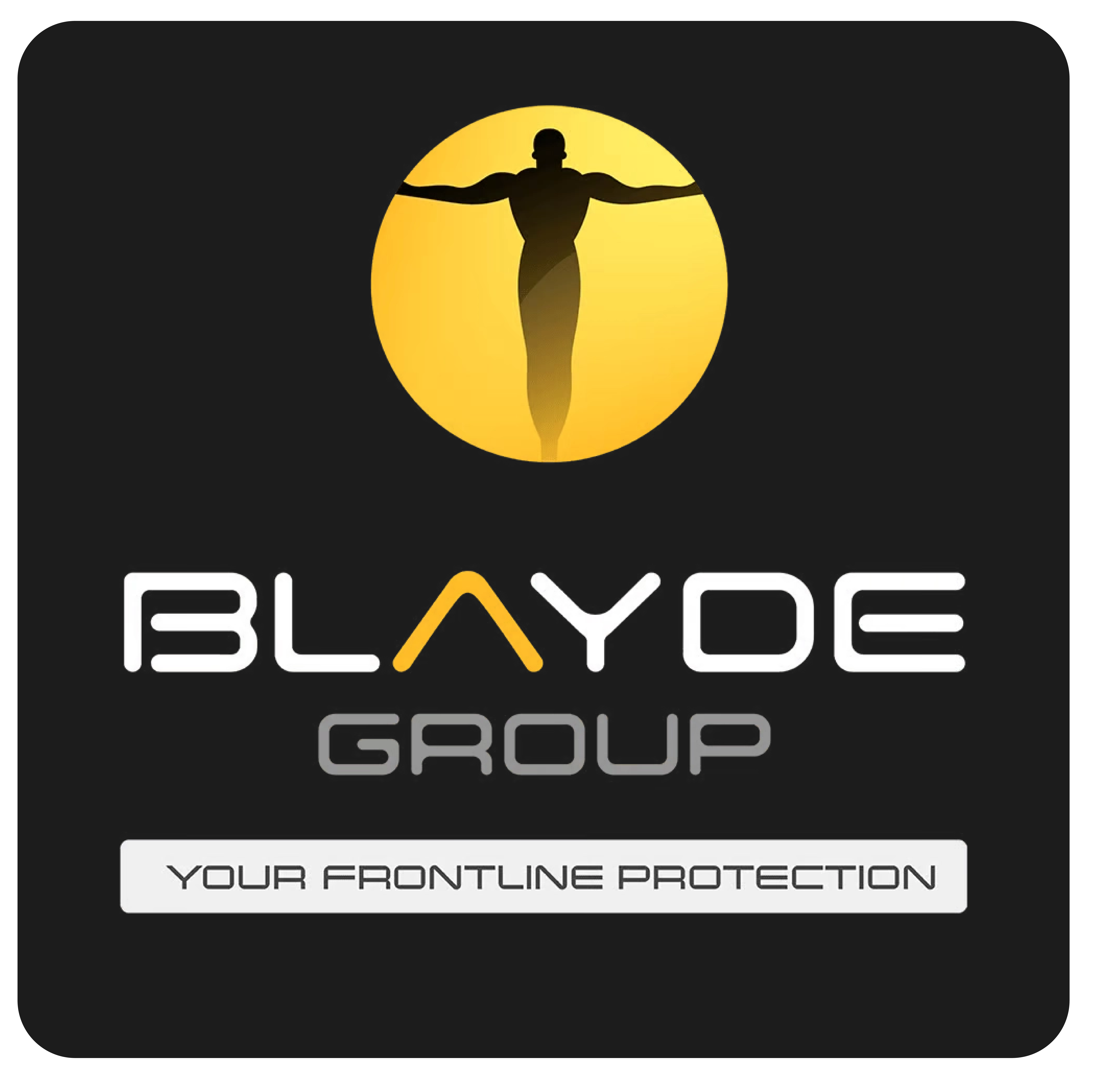
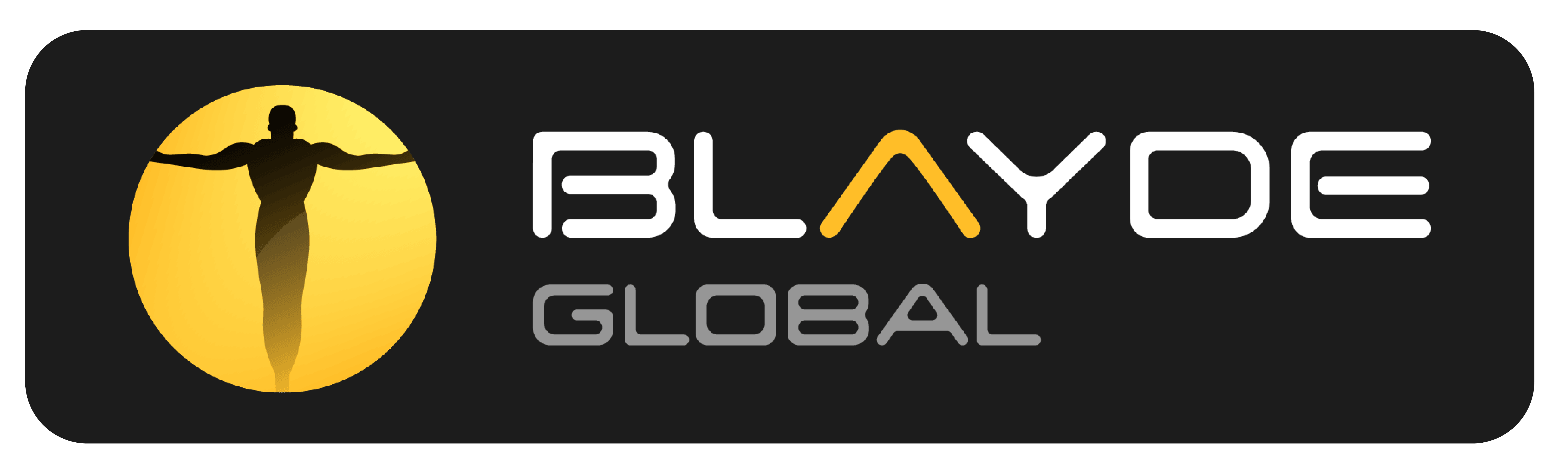
So we created logos for each: Blayde Group > Blayde UK Security, Blayde Training, Blayde Global Protection:
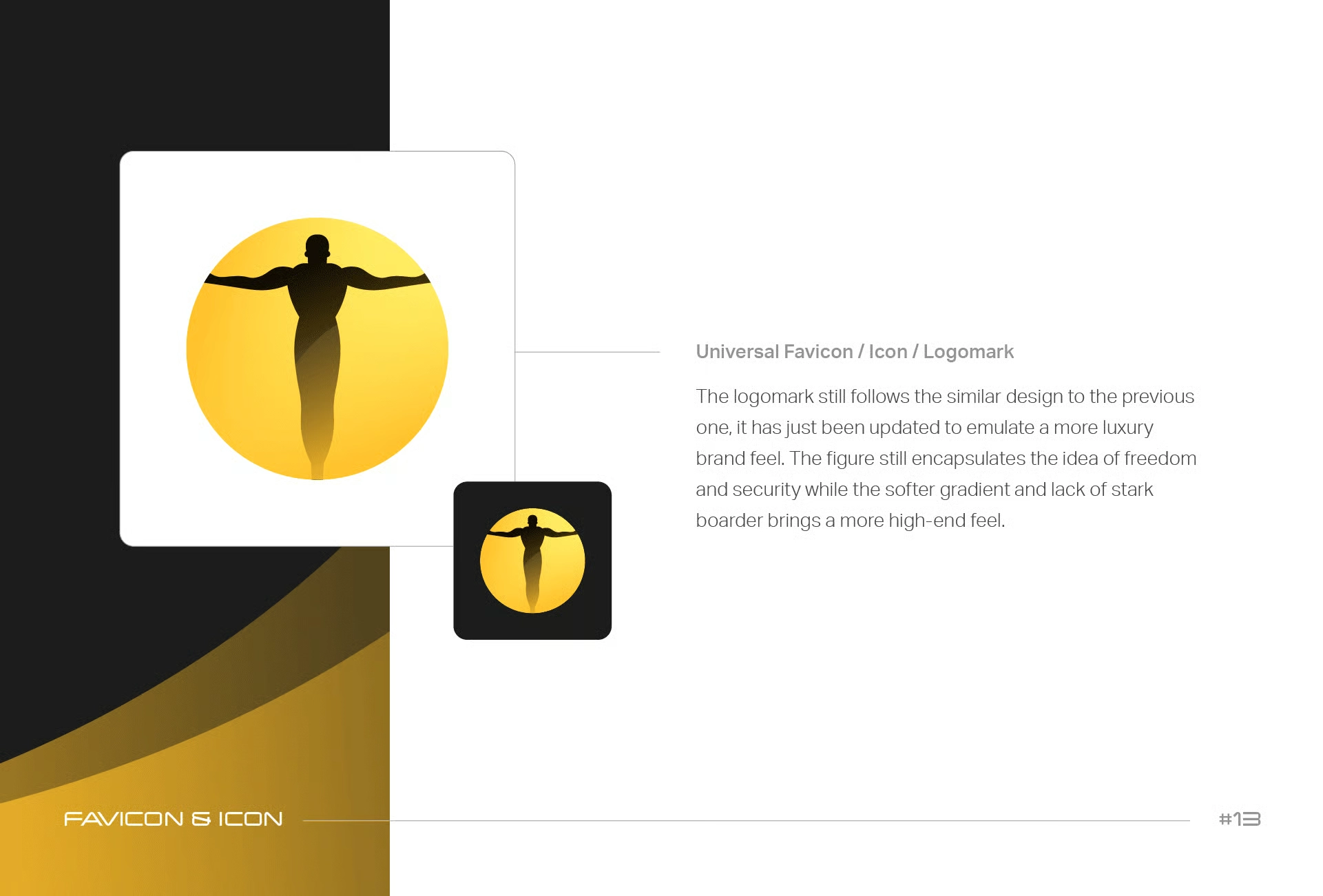
We kept the figure to ensure the brand remained recognizable, but we modernized and elevated it by removing the harsh border and clutter, plus added subtle gradients.
Black is often associated with luxury, so we introduced darker colors and sections to the brand, as well as making the primary logo white on black again to lean into that higher-end look.
So we created logos for each: Blayde Group > Blayde UK Security, Blayde Training, Blayde Global Protection:
We kept the figure to ensure the brand remained recognizable, but we modernized and elevated it by removing the harsh border and clutter, plus added subtle gradients.
Black is often associated with luxury, so we introduced darker colors and sections to the brand, as well as making the primary logo white on black again to lean into that higher-end look.


Step #2: Rewrite & Redesign
Phase #2:
Rewrite & Redesign
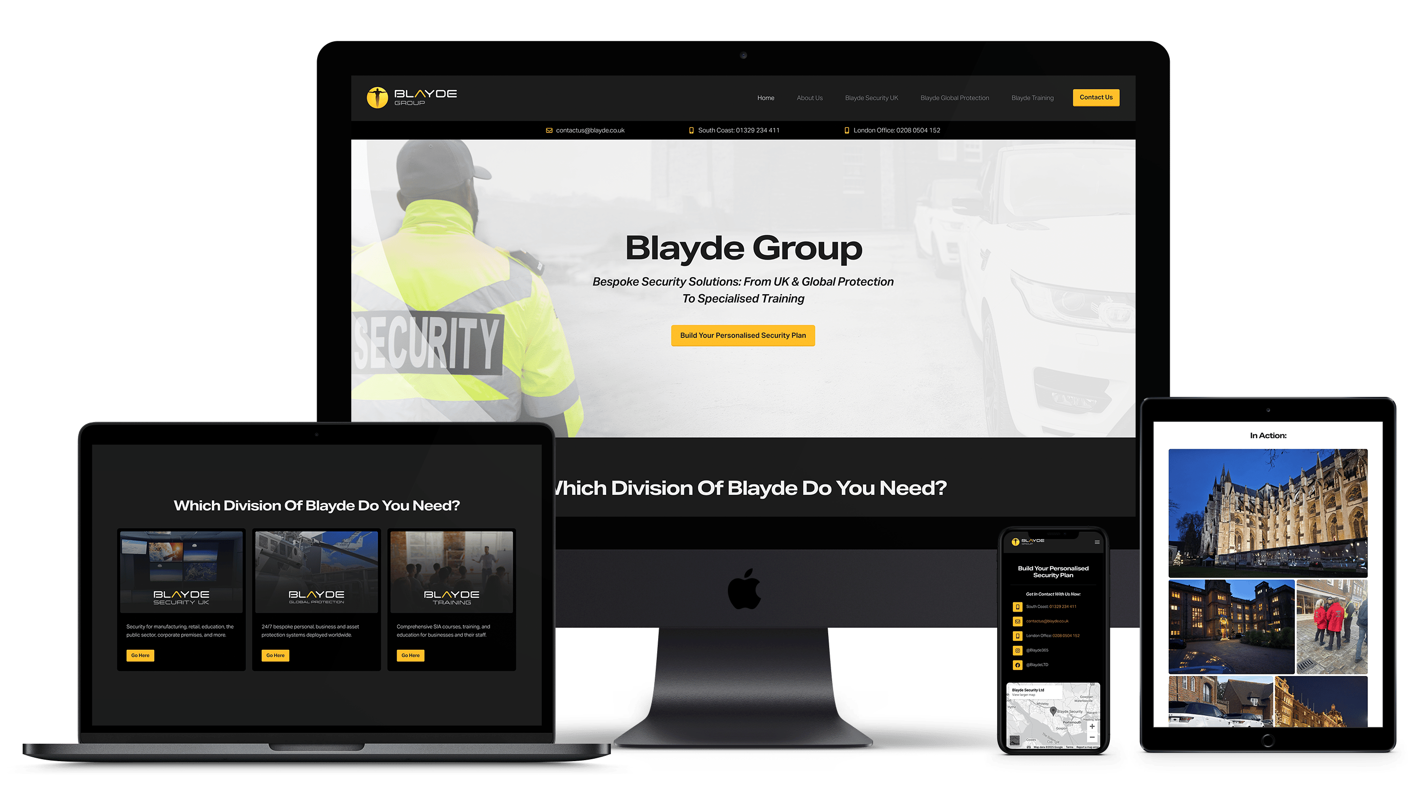
Old VS New Homepages
(Hover to scroll)
The Homepage
It was important to create a homepage that represented the newly restructured Blayde Group brand and clearly signposted to the 3 different divisions:
Blayde Security UK, Training & Global Protection.
We introduced instant credibility by including testimonials and demonstrating what makes Blayde different (its company values and unmatched reliability.)
In terms of design, we included a system in which we’ve optimized the typographical hierarchy to take the customer on a subconscious journey. It guides them from section to section to give them the best experience and help them better understand Blayde and what they offer.
Old VS New Homepages
(Hover to scroll)
Old UK Security
New UK Security
Old Global Protection
New Global Protection
Old Training Academy
New Training Academy
The Subdivisions
Copy and design aligned to ensure each division page was laid out in a similar format to ensure the website was congruent and easily digestible.
From a copy standpoint, it was important to reduce the overwhelming content on the original website and organize it in a way that instantly appealed to their target customer's pain points and needs.
We also introduced taglines to differentiate each division and immediately demonstrate the benefit of each.
Regarding the redesign, we included a light, subtle background image for the hero sections to help pull attention further to the headline.
We also introduced elements such as drop-downs and sliders to reduce the page length, organize information so it’s easier to comprehend, and add a dynamic feature.
Finally, we included page animations to ensure this dynamic look is congruent throughout the whole site and help draw attention.
(Further pages, including the “About Us” & “Contact Us,” remained consistent with the branding refresh & copy restructure.)
The CTA
The original website had no clear Call To Action.
We introduced a clear Call To Action section on every page that drew the eye and made it easy to contact the different Blayde Divisions using hyperlinked contact details and social media icons.
We also decluttered the footer to ensure the CTA was not lost when reaching the bottom of each page.
Step #3: Relaunch
Phase #3:
Relaunch
The Subdivisions
Due to the shift in positioning, our client needed us to integrate the updated website and host it on a new domain.
Our account management team facilitated this request to ensure redirects were set up correctly and that everything on the website (buttons, social media links, tabs, etc.) was working as it should.
Client Feedback:
"These pages look absolutely great! Thank you to you and your team for your patience, hard work and professionalism!"
Chris M
Blayde Group Director
Want Our Expertise To Transform Your Funnel?
© 2026 The Funnel Butler
This site is not a part of the Facebook website or Facebook Inc. Additionally, This site is NOT endorsed by Facebook in any way. FACEBOOK is a trademark of FACEBOOK, Inc.